How to Mix and Match Nail Accessories Tastefully — A Complete Guide to Balanced, Chic Nail Design
Nail accessories have a specific property that makes them both exciting and challenging to work with: a little goes a long way in both directions. The right rhinestone placement elevates an entire manicure. One too many competing elements makes the whole set look chaotic. The difference between a nail look that reads as intentional and beautiful and one that reads as overdone is almost always about editing rather than adding.
The good news is that the principles behind tasteful nail accessory mixing are learnable and consistent. Once you understand why certain combinations work and others don’t, the decisions become intuitive rather than guesswork.
Step 1: Establish Your Color Palette Before Anything Else
Every decision about accessories — which ones, how many, where they go — should be made after the color palette is established, not simultaneously with it. The palette is the framework. Accessories are the details within it.
Choose two to three colors that work together and commit to them before touching any embellishments. This doesn’t require elaborate color theory — some reliable starting points:
A monochromatic palette uses different shades and finishes of the same color. Blush pink nails with a rose gold foil and small champagne rhinestones all exist within the same warm pink-gold family, creating cohesion through color relationship.
A neutral plus one palette keeps most nails in a nude, white, or clear base and introduces one color through the accessories or accent nail. This is the most fail-safe approach for complex embellishments because the neutral background never competes with the accessory detail.
A complementary palette uses two colors that sit opposite each other on the color wheel — navy and gold, deep green and copper, burgundy and silver — for high-contrast combinations that look deliberately styled.
Whatever palette you choose, all accessory choices should stay within it. A rhinestone that doesn’t relate to the palette’s color story, regardless of how beautiful it is independently, will read as mismatched.
Step 2: Identify Your Statement Nail Before Adding Anything
The statement nail approach is the single most effective tool for mixing accessories tastefully, and it works because it solves the most common over-embellishment problem before it starts: spreading accessories equally across all ten nails, which dilutes their impact and makes the set look busy.
Designate one or two nails — typically the ring finger on one or both hands — as the statement nails before beginning any design work. These nails will receive the most accessories, the most complex design, or the most embellishment. All other nails are designed in relationship to the statement nail, staying simpler, less detailed, or completely plain.
This creates a visual hierarchy. The eye moves to the statement nail first, reads the design detail, then moves to the surrounding nails which provide context and balance. The contrast between the elaborate nail and the simpler surrounding nails makes the statement nail look more impressive than it would if every nail competed for attention equally.
A glittery accent nail with a few precisely placed crystals becomes stunning against matte, solid-color surrounding nails. The same nail in a set where every finger also has glitter and crystals disappears into noise.
Step 3: Mix Textures Rather Than Patterns
Texture contrast is what makes a multi-element nail look dimensional and interesting rather than flat. Pattern mixing — combining florals with stripes with geometric prints, for example — quickly becomes visually overwhelming. Texture mixing, done with restraint, reads as sophisticated.
The most effective texture pairings:
Matte and gloss. A matte base nail with a single glossy element — a rhinestone, a foil detail, a glossy accent nail — creates contrast through surface quality rather than color or pattern. The matte finish makes the gloss element read more brilliantly by contrast.
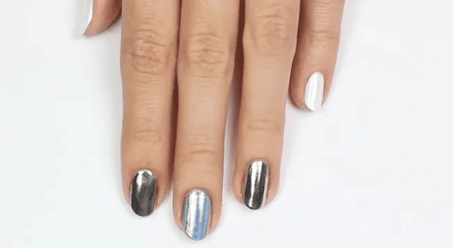
Smooth and textured. A smooth, glass-finish nail alongside a foil nail with visible texture creates depth within the same color family. The foil’s irregular surface catches light differently than a smooth polish, providing visual variety without competing colors or patterns.
Opaque and sheer. A solid opaque nail alongside a sheer nail with a subtle shimmer or jelly finish creates translucency contrast that’s interesting without being complex.
The rule of restraint: choose one primary texture contrast and maintain it across the set. Two contrasting textures — matte and gloss, smooth and foil — create dimension. Three or four different textures create chaos.
Step 4: Commit to a Theme That Unifies Every Element
A theme is a decision framework that tells you which accessories belong and which don’t, regardless of how beautiful something is in isolation. Without a theme, individual elements that are each lovely separately compete rather than cooperate when placed together.
Effective nail themes aren’t elaborate or costume-like. They’re simply a cohesive aesthetic direction:
Minimalist luxury — clean lines, one precise rhinestone or metal stud, neutral palette, high shine. Everything communicates restraint and quality.
Celestial — star, moon, and cosmic elements in silver, navy, and deep blue. Every accessory either references space or complements the palette.
Garden romantic — florals, leaf shapes, soft pinks and greens, pearl accents. The accessories share a soft, organic visual language.
Edgy geometric — clean lines, angular placements, metallic studs, black and gold. The accessories share a graphic, architectural quality.
Coastal — shells, pearl accents, seafoam and white palette, subtle iridescence. The accessories reference the ocean or its color story.
The test for whether an element belongs in your design: does it fit the theme? If a metallic stud is beautiful but the theme is garden romantic, it doesn’t belong regardless of its quality. Thematic consistency is what makes a complex multi-element manicure read as intentional rather than random.
Step 5: Approach Placement Deliberately
Where an accessory is placed communicates as much as which accessory you choose. The same rhinestone at the cuticle, at the tip, at the center, and along the side of the nail creates four completely different visual impressions.
Cuticle placement — accessories placed near the cuticle draw the eye upward toward the base of the nail and create a frame at the nail’s origin point. Single crystals or small accent elements at the cuticle look elegant and precise.
Tip or French tip enhancement — accessories along the nail tip or replacing the traditional French tip white line create a clearly visible, photo-friendly placement that reads well at conversational distances.
Center focal point — a single large or elaborate accessory centered on the nail creates a medallion-like effect that works best on medium to longer nails where the element has room to be the clear focal point.
Scattered pattern — multiple small elements distributed across the nail work when the distribution is genuinely intentional rather than random. A diagonal scatter from corner to corner, a gradient from dense at the base to sparse at the tip, or a deliberate asymmetric cluster all look more considered than elements placed without spatial intention.
Corner accent — small accessories placed at one corner of the nail (typically the lower corner nearest the cuticle) create a delicate, jewel-like effect that’s subtle and refined.
Before committing any element to glue or topcoat, hold it against the nail and visualize the completed design. Small adjustments in placement — a millimeter in any direction — can significantly change how an element reads in the finished design.
Step 6: Edit for Balance at Every Stage
Balance doesn’t mean symmetry — it means that the visual weight of the design is distributed in a way that feels resolved rather than heavy on one side or one nail.
If one nail carries heavy embellishments, the surrounding nails should carry lighter or no embellishments. If your ring finger has a large rhinestone cluster, the adjacent middle and pinky fingers should be comparatively simple — a solid color, a single small crystal, or completely unembellished.
If your design uses glitter as the primary texture element, pair glitter nails with matte or satin nails rather than with additional textured elements. If your design uses foil, keep other elements simple enough that the foil’s visual contribution isn’t lost.
A practical balance check: look at the complete set of nails at arm’s length. Does the eye move fluidly across the set, or does it get stuck on one element? Does the set feel resolved, or does it feel like something is missing or something extra is competing? The arm’s length view reveals balance issues that close-up examination misses.
Step 7: Seal Everything With the Right Top Coat
Top coat isn’t just the finishing step — for accessorized nails it’s the structural step that determines how long the design lasts and whether three-dimensional elements stay secured.
Standard top coat is appropriate for flat accessories — foil, decals, thin metallic elements, glitter embedded in polish. Apply carefully over the design to avoid dragging flat elements out of position.
Gel top coat (cured under a UV or LED lamp) provides significantly stronger adhesion for three-dimensional elements — rhinestones, studs, beads, larger crystals. A non-wipe gel top coat specifically creates the most durable seal. For any accessory with physical height above the nail surface, gel top coat is worth the investment over regular top coat.
Application technique for embellished nails: Apply top coat in gentle, fluid strokes that glide over accessories rather than pressing into them. Multiple thin layers create a more even encapsulation than a single thick layer, which can drag elements or pool around their edges.
For rhinestones and similar elements, applying a small amount of gel base coat or nail glue beneath the element before placing it, followed by top coat or gel top coat over it after placement, creates the most secure and long-lasting bond.
Final Thoughts
Tasteful nail accessory mixing comes down to a few consistent principles: a cohesive color palette established before any accessory decisions, a clear statement nail hierarchy that concentrates embellishment and leaves surrounding nails to support rather than compete, texture contrast used with restraint, thematic consistency that makes every element feel like it belongs, deliberate placement informed by how placement communicates visually, balance assessment at arm’s length, and appropriate top coat that protects the finished design.
None of these principles require extensive experience or elaborate tools. They require the decision to edit as actively as you add — because in nail accessory design, what you choose not to include is as important as what you choose to include.
Start with less than you think you need. Step back and assess. Add deliberately. The most consistently beautiful nail accessory designs are almost always the ones where every element was chosen with a clear reason.